Introducing an Expanding Keyboard for Small Screens
Introduction
Text entry on small IoT device screens can be frustrating to use because when a touch keyboard designed for mobile devices is shrunk down to fit on a small screen, accurate typing becomes too difficult. That makes entering a Wi-Fi password, for example, an unpleasant and challenging experience. In this article we introduce our unique expanding keyboard solution, optimizations we made to make the experience great and explain how to integrate the expanding keyboard into your products.
A New Kind of Keyboard
We are accustomed to using smartphones and tablets with touch screens in our daily routines. These devices have onscreen keyboards that are quick and easy to use to enter text. The screens are large enough for us to accurately tap intended keys. When we do miss, auto-correction often helps. Unfortunately large screens and auto-correction are not available on small IoT device screens.
Using the Moddable SDK, developers can deliver beautiful and responsive user interfaces even on low-cost, resource-constrained IoT devices with small touch screens. Further, we believe that users should be able to configure their devices, e.g., enter Wi-Fi credentials, name the device, etc... without having to use a mobile companion app.
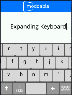
To support text entry on the Moddable One and Moddable Two products, we designed a new kind of keyboard for small touch screens. The keyboard looks like the familiar mobile onscreen keyboard but works a little differently to increase typing accuracy on small screens. Our IoT keyboard uses two taps for each character entered. The first tap indicates the area of interest and causes the keyboard to zoom in, making the keys larger. The second tap selects the key and zooms back out to the original keyboard, ready to select the next key. This two step process allows users to easily and precisely enter text on the 240 x 320 pixel touch screen displays. Both vertical and horizontal keyboard orientations are supported. The keyboards are easily integrated into Piu apps with a minimal amount of code.
div class="row mb-3">
Add the Expanding Keyboard to Your Project
The expanding keyboard can easily be added to your project with a minimal amount of code. The modules we provide fully implement the keyboard visuals, interactions, event triggers, and animations. In this section we summarize the module APIs and provide the code required to integrate the expanding keyboard into your project.
The expanding keyboard implementation consists of HorizontalExpandingKeyboard and VerticalExpandingKeyboard Piu Container objects to integrate with horizontal and vertical screen orientations respectively. In addition, a KeyboardField helper object is provided that displays the text entered with a blinking I-beam cursor. We recommend using the KeyboardField object to simplify adding the expanding keyboards to your apps.
import {} from "piu/MC";
import {VerticalExpandingKeyboard} from "keyboard";
import {KeyboardField} from "common/keyboard";
Applications simply need to import these Container objects and add the Containers into a screen layout. The example code and screen shot below shows the vertical expanding keyboard and text entry field integrated into a full-screen display.
const KeyboardContainer = Column.template($ => ({
    left:0, right:0, top:0, bottom:0, active:true,
    contents:[
        Header($, {
            anchor:"HEADER", left:0, right:0, height:40,
            Style:HeaderStyle, Skin:HeaderSkin
        }),
        KeyboardField($, {
            anchor:"FIELD", password:false, left:32, right:0, top:30, bottom:30,
            Skin:FieldSkin, Style:FieldStyle
        }),
        Container($, {
            anchor:"KEYBOARD", left:0, right:0, bottom:0, height:185,
            Skin:BackgroundSkin
        }),
    ],
    Behavior: class extends Behavior {
        onCreate(column, data){
            this.data = data;
            this.data["KEYBOARD"].add(VerticalExpandingKeyboard(this.data, {
                style:new KeyboardStyle(), target:this.data["FIELD"], doTransition:TRANSITION
            }));
        }
    }
}));
Constructors
A dictionary of configuration properties is passed to the expanding keyboard class constructors. There are two required properties.
const KeyboardStyle = Style.template({ font:"18px Roboto", color:"black" });
let keyboard = new VerticalExpandingKeyboard(null, { Style:KeyboardStyle, target:this.data["FIELD"] });
| Parameter |
Type |
Default Value |
Description |
Style |
function |
n/a |
Required. A function that creates instances of Style.prototype. The keyboard will create an instance of this style, and set its style property to the created instance. The keyboard key text is rendered using this style. |
target |
object |
n/a |
Required. A Piu Container object that will receive the onKeyUp events. Note that the KeyboardField object automatically processes onKeyUp events. |
doTransition |
boolean |
false |
Whether or not to transition in the keyboard when it is first displayed and transition out when dismissed. |
Similarly, the KeyboardField constructor accepts a dictionary of configuration properties. Only the Style property is required, since there is no default font on embedded devices.
const FieldStyle = Style.template({ font: "20px Open Sans", color: "black", horizontal:"left", vertical:"middle" });
let keyboardField = new KeyboardField(null, { Style:FieldStyle });
| Parameter |
Type |
Default Value |
Description |
Style |
style |
n/a |
Required. A function that creates instances of Style.prototype. The keyboard will create an instance of this style, and set its style property to the created instance. The keyboard input text is rendered using this style. |
password |
boolean |
false |
Set true to enable password mode. The password mode hides each character displayed after a short delay. |
Events
The expanding keyboard behaviors bubble events up the container hierarchy. The onKeyboardOK event contains the text string entered on the keyboard. Other events are optional and are used to synchronize keyboard animations with other UI element behaviors, for example navigating to another screen after the keyboard completes its exit animation.
class KeyboardAppBehavior extends Behavior {
    onCreate(application, data) {
        this.data = data;
    }
    onKeyboardOK(application, string) {
        trace(`String is: ${string}\n`);
    }
}
| Event |
Description |
onKeyboardOK |
Triggered when the keyboard OK button is tapped |
onKeyboardRowsContracted |
Triggered when the keyboard rows have been contracted back to the unzoomed view |
onKeyboardRowsExpanded |
Triggered when the keyboard rows have been expanded to the zoomed view |
onKeyboardTransitionFinished |
Triggered when the keyboard completes transitioning the key rows on or off the screen |
The full API for the expanding keyboard modules is described in the Expanding Keyboard Reference document on GitHub.
How We Implemented the Expanding Keyboard
Our expanding keyboard is easy to use both because of its design and its implementation. By delivering predictable touch behavior and smooth, flicker-free animation the user can stay focused on text entry. This result is only possible because a considerable amount of effort was put into optimizing both the module design and user interaction. As a result, the keyboards perform well even on extremely inexpensive and resource-constrained devices. In this section we take a closer look at a few optimizations that significantly improved performance.
Rendering Optimizations
Once we had the basic keyboard working, we measured the animation frame rate and found that we were only achieving 14-15 frames per second (FPS) on the Moddable Two with an ESP32. The animation felt sluggish. We knew we could do much better. The vertical keyboard animates 40% of the screen pixels when expanding and contracting key rows. The Moddable SDK SPI implementation coupled with our fast, memory-efficient graphics rendering is capable of refreshing 240 x 320 displays at 60 FPS. To pinpoint the slowdown, we timed different portions of the keyboard drawing code and found two issues. First, our rendering of the images that make up the keyboard was taking too much time. Second, we were measuring the same text multiple times, also taking unnecessary time.
Our initial implementation used an RLE compressed texture strip of key masks (see image below). Keys are drawn by rendering a tinted version of the key mask at the current zoom level. The key cap text is then rendered on top of the key image.

Key mask texture strip
The keyboard row expansion animation consists of seven steps, where each step increases the zoom level and hence key width. While the key mask strip is memory efficient, unfortunately it is slow to render because rendering a subset of an RLE compressed image requires stepping through every pixel in the bitmap before the area of interest, scanning left to right and top to bottom. Hence as the keyboard rows expand, rendering each step in the animation takes increasingly longer because more of the strip needs to be decompressed at each step to reach the target area. Thankfully the solution was easy - instead of using a single strip of key masks, we use a separate key mask image for each step. Only the image being drawn is decompressed, substantially reducing the time required to render each key row.
Once we resolved the texture rendering issue, we focused on improving our text measurement and drawing speed. We implemented a number of straightforward optimizations here that significantly improved performance:
- Calculate and cache each character's width in the keyboard font, in addition to the font height, when the keyboard is instantiated.
- In each expanding keyboard row, store each key character and width in a simple
Array that gets traversed at render time.
- Store the widths of the key masks for each zoom level in a simple
Array in the keyboard object. This table provides a quick lookup of the key width by zoom level, which reduces the amount of code required at render time to center the key cap character over the key.
By optimizing our texture and text rendering techniques, we more than doubled our rendering speed. With these optimizations in place, the vertical keyboard row animation now runs smoothly at 29 FPS. Even on the slower ESP8266 Moddable One, the animation runs at 22 FPS. It was well worth the effort to pinpoint and address the performance bottlenecks in order to deliver the highest quality experience to developers and users.
User Interaction Optimizations
At Moddable, we not only obsess over code efficiency and design, but we also spend a lot of time ensuring that the product user experiences we deliver on small devices exceed expectations. To do that requires using the product as our customers would. While using the expanding keyboard, we identified and addressed a number of user interaction issues.
Region of Interest
When a user taps the keyboard, they are expressing their interest in a key that is located around where they tapped. When the keyboard is tapped and zoomed, the region of interest should be underneath the tap point. Therefore we designed the keyboard touch handling to zoom the keyboard relative to the touch point. In other words, the relative position of the keyboard at the touch point remains the same before and after the keyboard expands. This way, the user can quickly tap the desired key after the keyboard expands. The video below, captured in our desktop simulator, shows this in action using the mouse pointer.
This technique works well for keys in the center portion of the keyboard, the since the region of interest is well defined. On the other hand, the same technique yields a suboptimal experience when tapping keys on the right and left keyboard edges. When tapping along the edges, the intended key may be partially clipped by the edge of the screen, making the key no easier to tap compared to the unexpanded size. As an example, consider a tap on the upper right corner of the 'l' key. The region of interest includes not only the 'l' key but also the 'o' and 'p' keys. All three keys should be fully visible after the expansion. When tapping along keyboard edges, to ensure that all the keys in the region of interest are visible, the implementation applies a non-linear zoom heuristic that decreases the amount of clipping of the edge keys proportional to the tap distance from the edge.
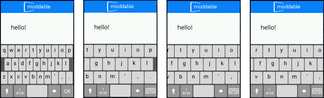
Expanding right edge keys
The first image above shows the keyboard in the unzoomed state. The second image shows the expanded keyboard after tapping the upper right corner of the 'l' key. Notice that the 'l', 'p' and 'o' keys are fully visible. The third image shows the expanded keyboard after tapping the upper left corner of the 'l' key. The 'k' and'o' keys are fully visible since they are both in the region of interest. Finally the last image shows the expanded keyboard after tapping the left edge of the 'k' key. The 'k', 'j' and 'i' keys are all in the region of interest and fully visible.
Tap Feedback
Once the keyboard is zoomed, it is important that the user gets visual confirmation on the second tap that the intended key is pressed. Their visual focus is on the key pressed, not on the text input field. To reinforce the key press, we decided to invert the key when tapped and also reverse fade the key and text color when the key is released. This way there is visual confirmation starting when the key is tapped though the keyboard contraction animation. The video below, captured in our desktop simulator, shows the tap feedback in slow motion.
Ignore Key Edge Taps
Once the keyboard is expanded, the user can easily tap the intended key. That said, sometimes the wrong key can be pressed, especially when the user presses harder and the resulting touch area is larger. To mitigate this potential error, we ignore taps between keys, rows, and taps within two pixels of each key left and right edges. Instead of guessing intent, we found it is better to ignore the tap and let the user try again.
Conclusion
Our expanding keyboard makes text entry practical on very small screens, opening new uses of displays in IoT products. Users are immediately comfortable using the keyboard because its design re-uses familiar elements while adding a new behavior. It feels just right. The smooth animation and accurate typing results make it a pleasure to use. The highly optimized implementation makes it feasible to add the expanding keyboard to even extremely inexpensive devices.
To get you started with the expanding keyboard, we have example apps for both vertical and horizontal orientations. For a more complete example, check out our Wi-Fi configuration app, which integrates the expanding keyboard into a Wi-Fi access point connection flow. We hope the expanding keyboard module enables exciting, new user experiences in your products.